While it would be great if spudWorks were sent samples of new products to test and then report on, we’re apparently not yet big enough and, so, all paints mentioned in this article were purchased by the author for testing. Needless to say, that also means we haven’t been paid for any opinions expressed herein.
Like a lot of people who are involved in the hobby, I use Warhammer (né Citadel) paints to smother my miniatures in color. I’m not a brand loyalist. It’s more a matter of convenience. When I got back into the hobby, it was with a Citadel starter paint kit and I just expanded my collection of paints over the years. I stuck with Citadel because, after a while, I’d been using them to moderate success (any failures certainly weren’t the paints’ fault), and I just didn’t feel very much like experimenting with other brands.
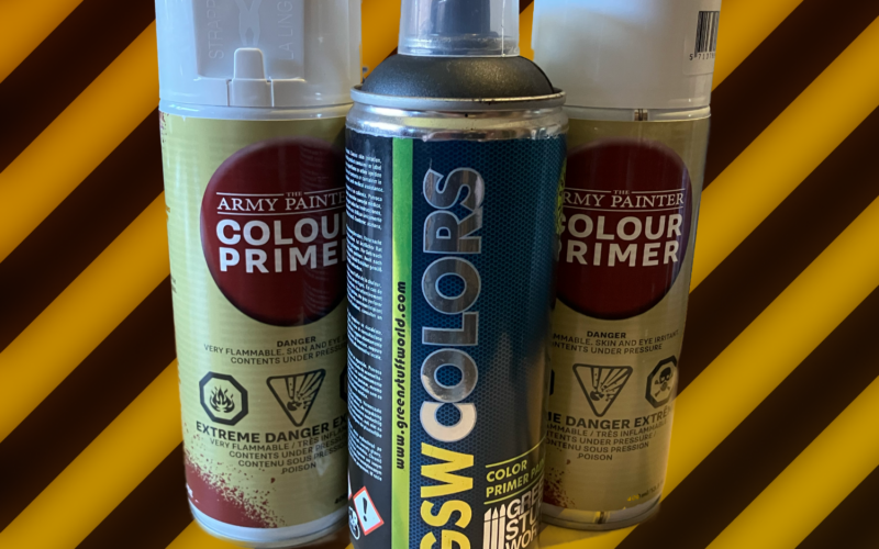
I know there are other paints out there. Army Painter being one, and one I’ve used as a primer for years now. And AK Interactive as another. I know there are people who swear by Vallejo. And, if I went to a lot of different hobby shops where they had a lot of different paint ranges, I might look at other paints, not because I care deeply about pots versus droppers, but because my access to buying and replacing paints would be easier.
Because I mostly go to my local Warhammer store here in Hamburg, and they only carry their own paints (because, of course), it’s just easier for me to stick with the Citadel system. Also, and this shouldn’t be ignored, since I’ve been painting with Citadel paints for over six years now, I’m just used to how they work in terms of coming out of the pot, with water or medium added, how they get applied. All of that is part of the paint experience, whether one thinks about it or not. And I really hadn’t because I used a system and this was just how the paint reacted when I did these things.
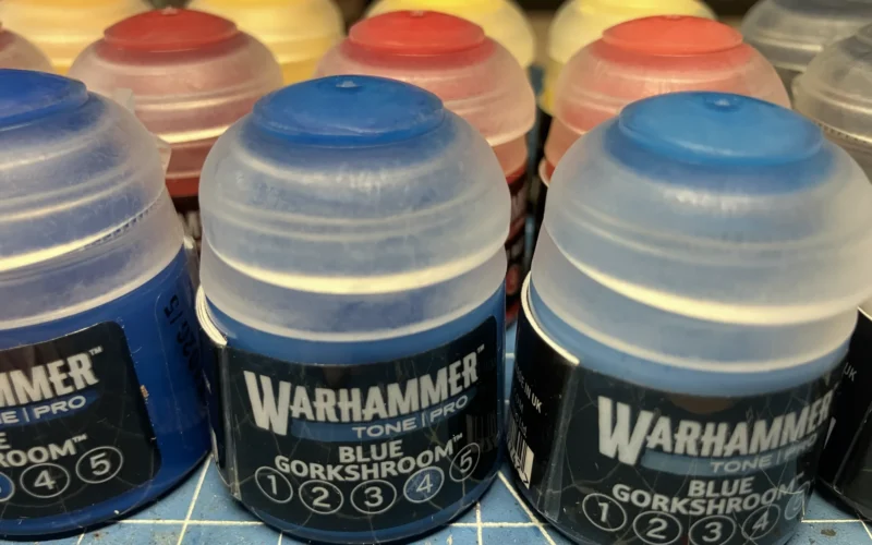
Then Games Workshop had to go and announce a new paint line. Warhammer Tone Pro. Better coverage. Better pigments. Better everything. And, according to someone I spoke to at the company, the future of the Games Workshop paint line. As in, replacing the existing paint line.
This is just a rumor, right now. But it’s also not a silly one. If there really are 150 paints in the Tone Pro line, maybe that does replace the old Citadel/Warhammer paints. I’m not a retailer but I can definitely see the arguments for it.
But, here’s the thing… The Tone Pro paints are a brand new formulation and they do not act like the old paints at all. Like I’ve been trying to work through with Necromunda, this isn’t necessarily a good or bad thing. It could just be… different… with its own set of positives and negatives.
So let’s dive into this new range of paints! See what they’ve got going for them and where they’re kind of weird. Because there are elements of these paints that are both.
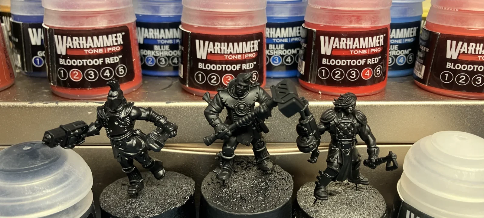
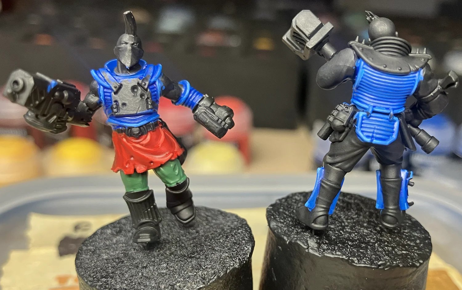
First, to let you know the set up, I’m using three hive scum miniatures I built specifically for this test. I undercoated each one with a different primer to test those primers but, to ensure the application of Warhammer Tone Pro worked the same on each mini, I then gave each mini a layer of very thin Abaddon Black once or twice to ensure the base was consistent. They were all painted inside at about 65% humidity and all paints were transferred from the pot to my wet palette before being applied to the miniature.
Testing Parameters
These are the conditions under which I ran my paint tests and I did this because these are essentially the conditions under which I usually paint. Hamburg is a generally humid city, I always paint with a wet palette, and I don’t usually concern myself with primer but, in this case, I did because of the kind of test I’m doing.
Additionally, while I usually water down my paints significantly, in this case I attempted various applications including straight from the palette and thinned with water and really thinned with water. Where this happened, I will mention but all base coats should be assumed to be straight from the palette without any water, mostly because I wanted to see how fast I could cover the black undercoat and how much it might gum up the details.
Pot Consistency
The paint as it comes out of the pot feels strangely thin. If you haven’t already transferred it all to droppers, you’ll find that using the brush to scrape out a bit of paint onto the palette is a little strange in that it feels runny and might fall off the brush. When a Citadel paint is taken from the pot it feels very thick and holds onto the brush, as if for dear life. The Tone Pro paints feel more like a Contrast paint.
a little bit of water doesn’t seem to affect the paint very much
What’s interesting is that a little bit of water doesn’t seem to affect the paint very much. If it would cover an area with full pigmentation before, it would still mostly do so with a little bit of water. The thinner mixtures also didn’t seem to have any issues with hydrophobic beading. Everything still went on, nice and smooth and dried nice and smooth as well.
The interesting thing, versus old Citadel paints is that, regardless if out of the pot or in a couple of thin layers, it never got chunky. It’s almost as if it shouldn’t be watered down if this is the case. Or at least not as a base layer application.
Palettes: Wet & Dry
Based on using these paints for about eight hours, it’s hard to ascribe intentionality to how the paints are meant to be used. I’ve been using a wet palette for the better part of five years and found it’s helped both my painting and preserved my paints better over the course of a session.
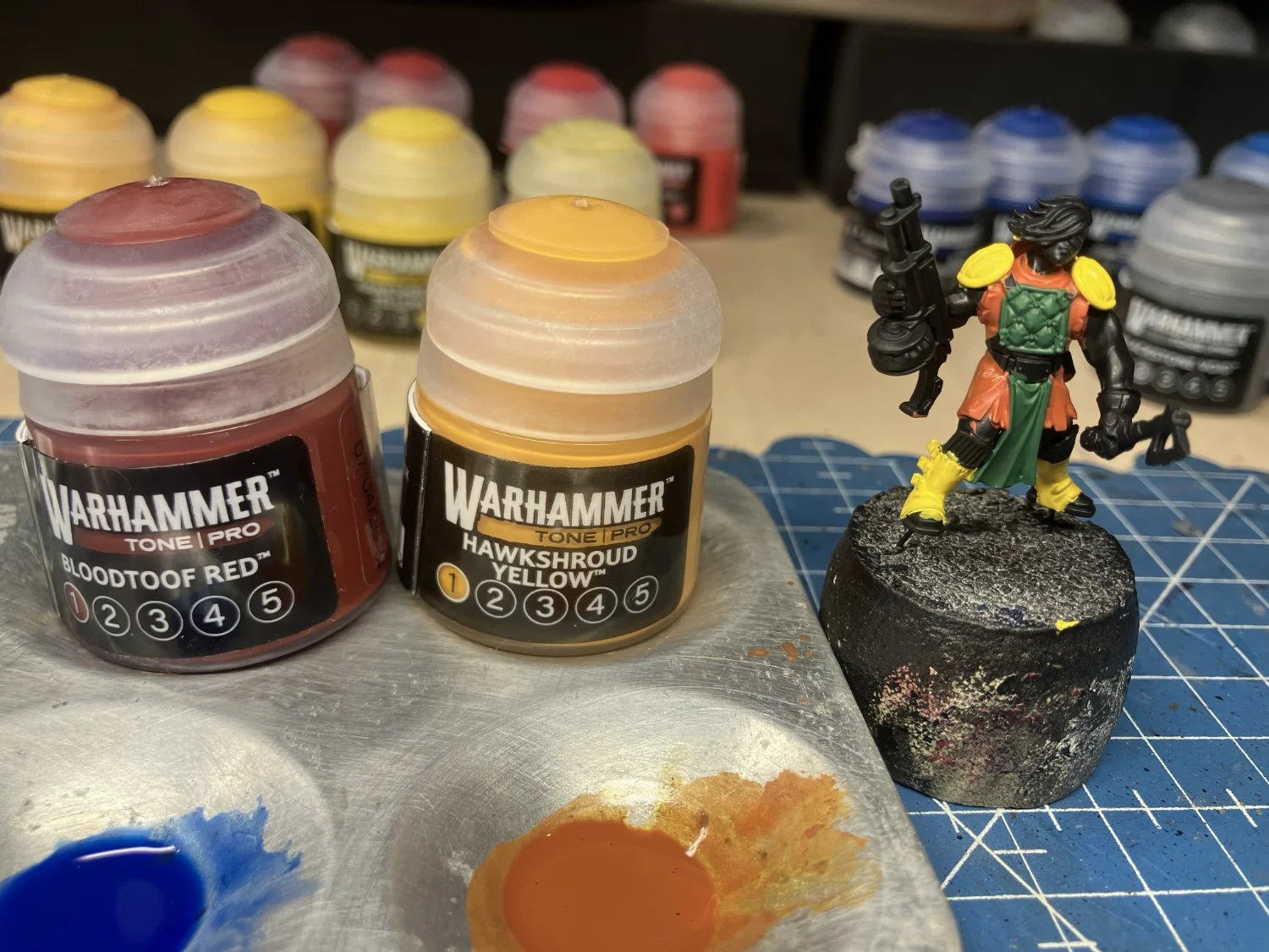
I’m not entirely sure Tone Pro paints are intended to be used with a wet palette. For one, they seemed to absorb water like I do whiskey. A lot and quickly. Which led them to become over-saturated with water. This led to a couple of orange mixes I’d made earlier with red and two different yellows to bleed together to become one mono pool of basically orange. And then it could be used for glazing but that was about it.
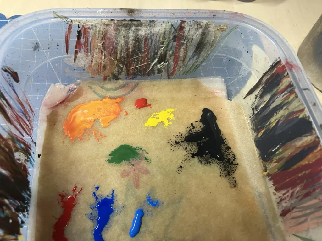
It still covered better than an over-saturated Citadel paint. But only just. And the pigments had to be stirred back in regularly. Considering that my wet palette hadn’t been refreshed in a few days and was on the drier end of “wet” palettes, this was a bit surprising and unexpected.
I don’t like to leave my pots open when I paint because they would obviously dry out over time. But I did begin to wonder if the paint really wasn’t intended to be transferred to a dry palette and applied from there. Having used a wet palette for so long, it was a little unsettling.
So, just to give it a shot, I tried a dry palette and it had almost none of the water saturation problems. But I did find that if I put a small amount on the palette, it would dry out, same as if applied to a model. More paint would still eventually dry, of course, but could be staved off by adding a half-brush of water now and again. It’s not a perfect solution. One requires re-opening the pot more often than one should whereas the other still risked becoming water-saturated if not very careful. It’s almost enough to make me re-consider my position on pots.
Base Layers
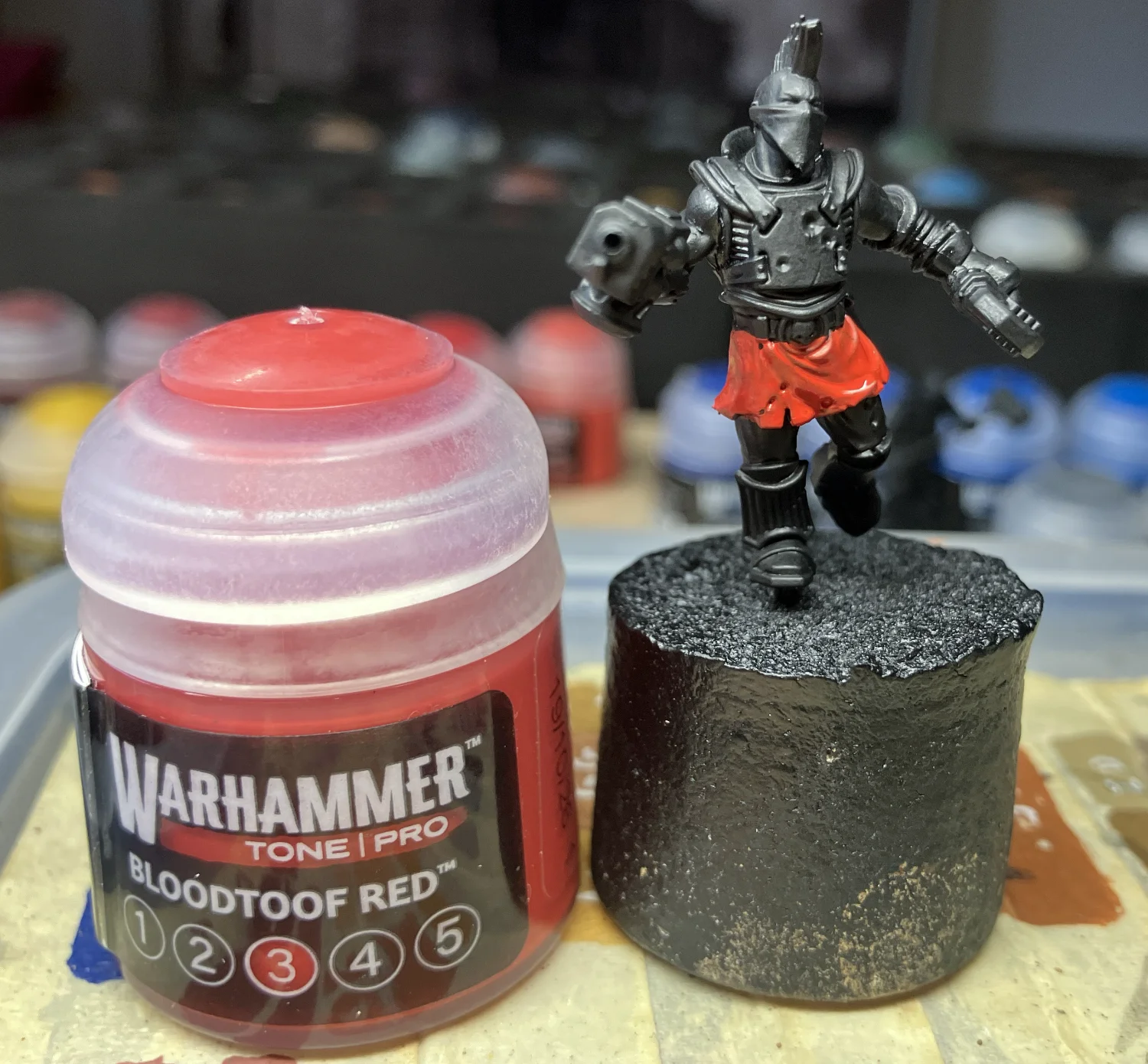
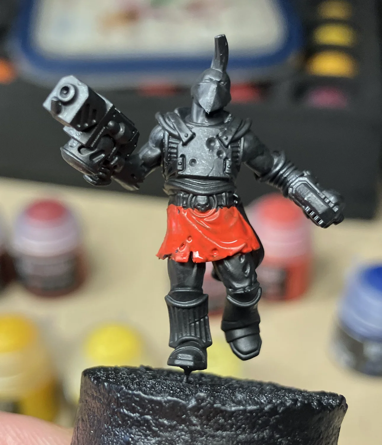
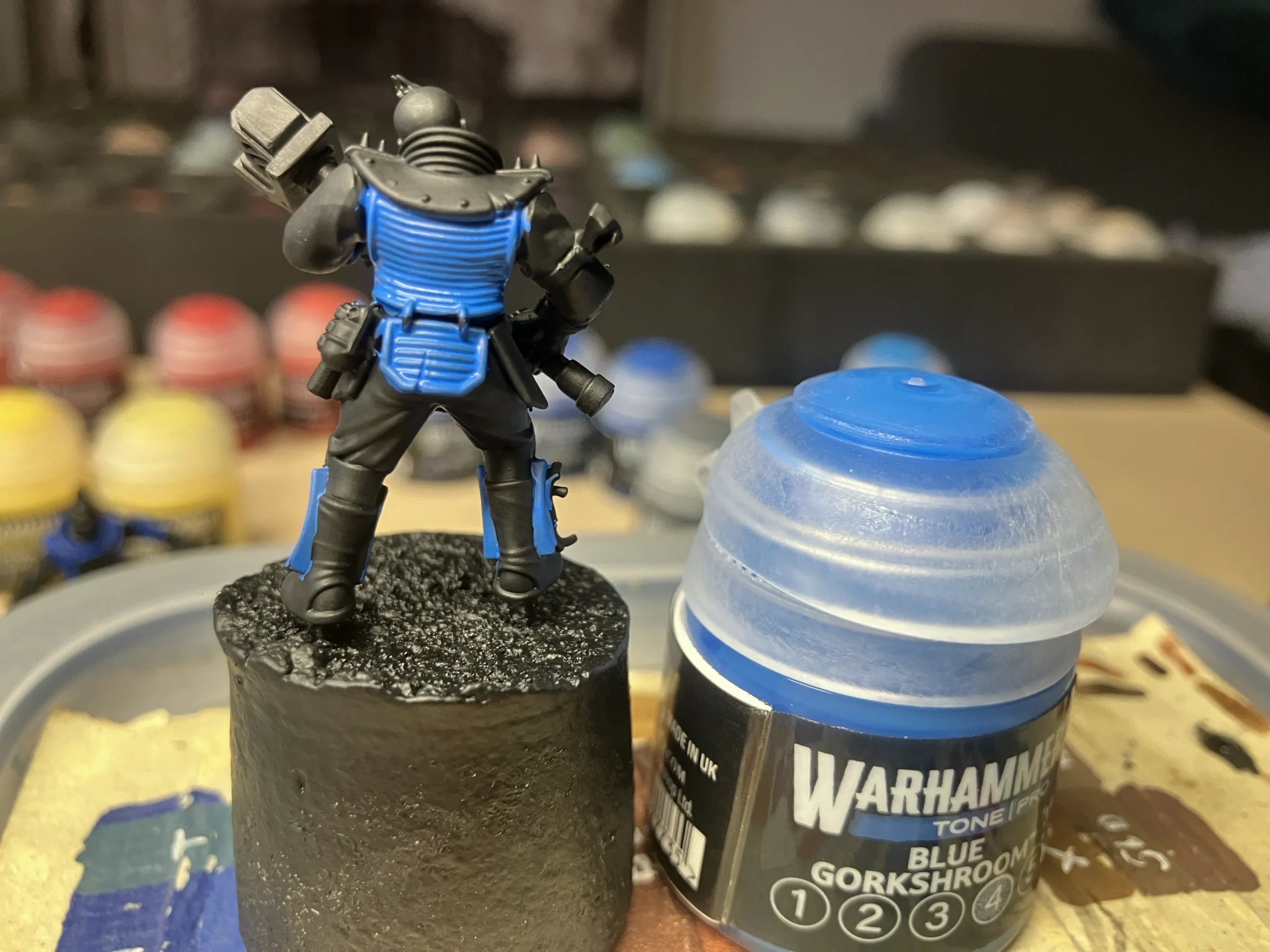
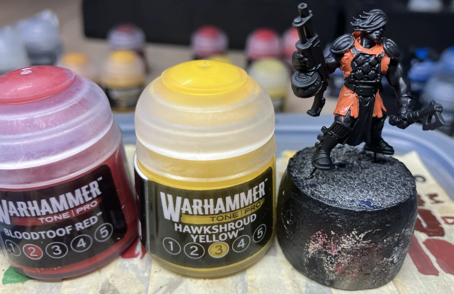
If there’s one area where Warhammer Tone Pro paints deserve recognition, it’s with how easy it is to get historically problematic colors on over a black prime. White, orange, yellow… they all covered within two or three layers.
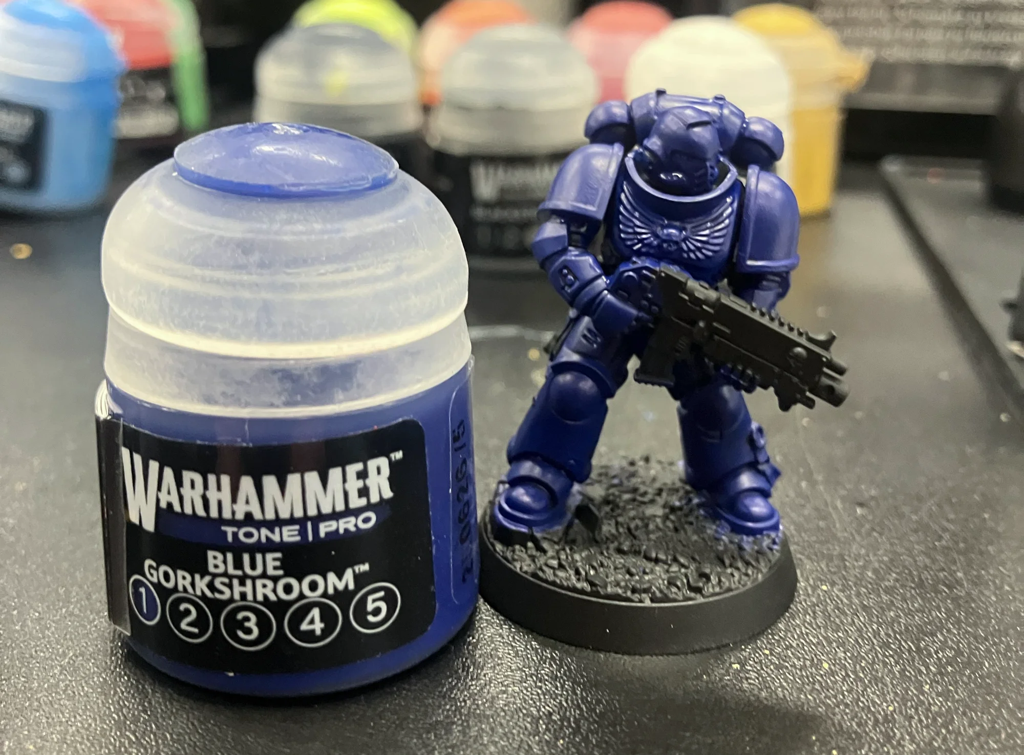
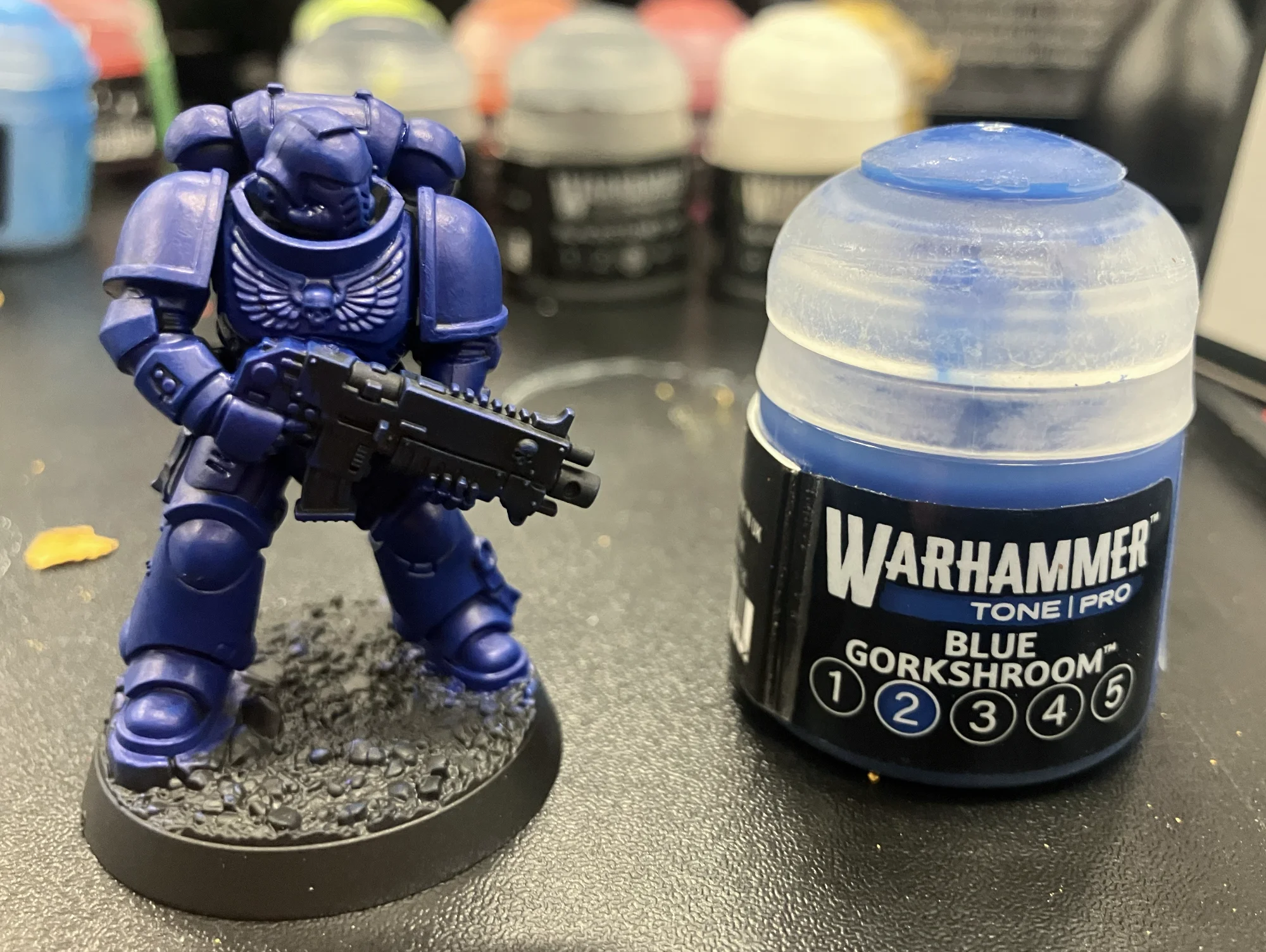
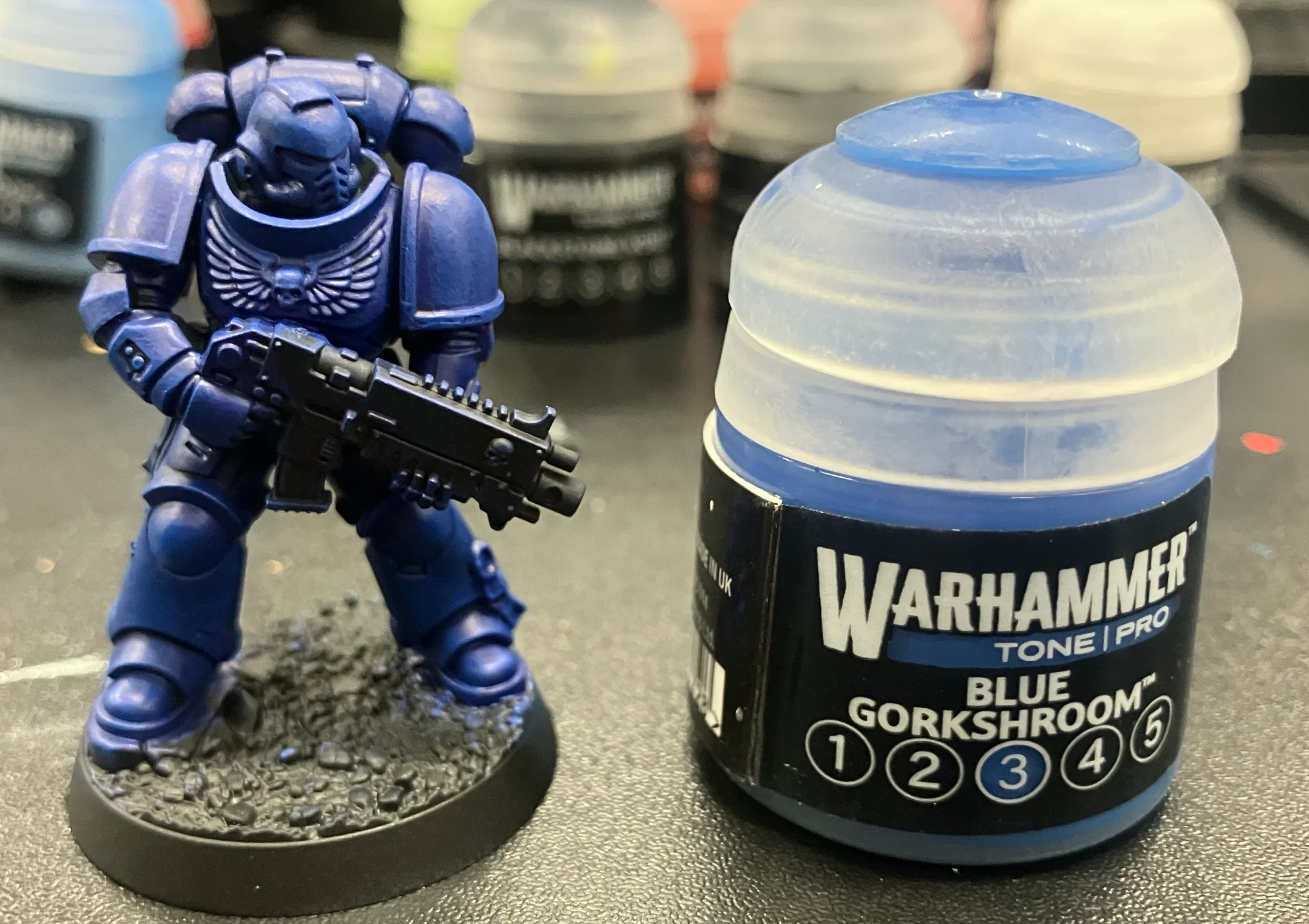
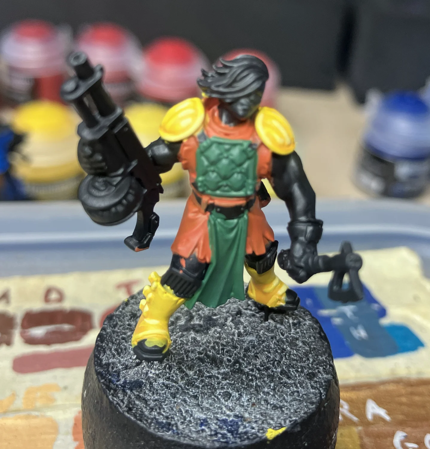
When base-coating my test models, I tended to use the third tone for the colors as it was a good mid-point to be able to test darker toned washes on one side and detail highlighting on the other. Dark colors like red and blue covered a black base-coat in maybe a little more than one base-coat. And by that I mean, maybe a few flat areas needed a second coat but I wasn’t having to hit the whole model again with another layer. Yellow did take about three coats to fully cover the black but, surprisingly, it still didn’t gunk up any of the details. And when I made my own orange, its application sat firmly between the quick red application and the few extra yellow layers. My own green mix went on even easier.
Trying to base-coat with higher number tones does start to require a few more layers. Which makes sense if you think about what these tones are doing.
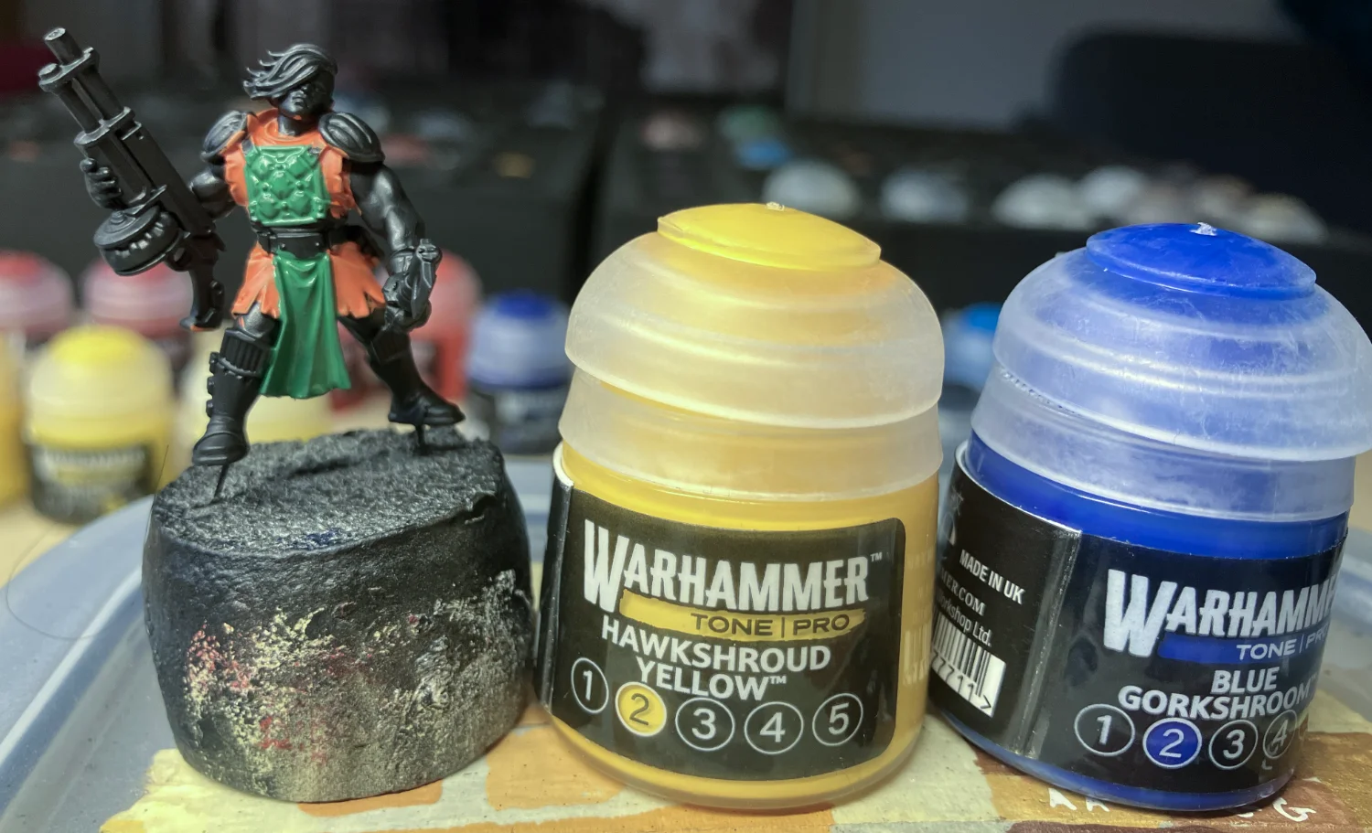
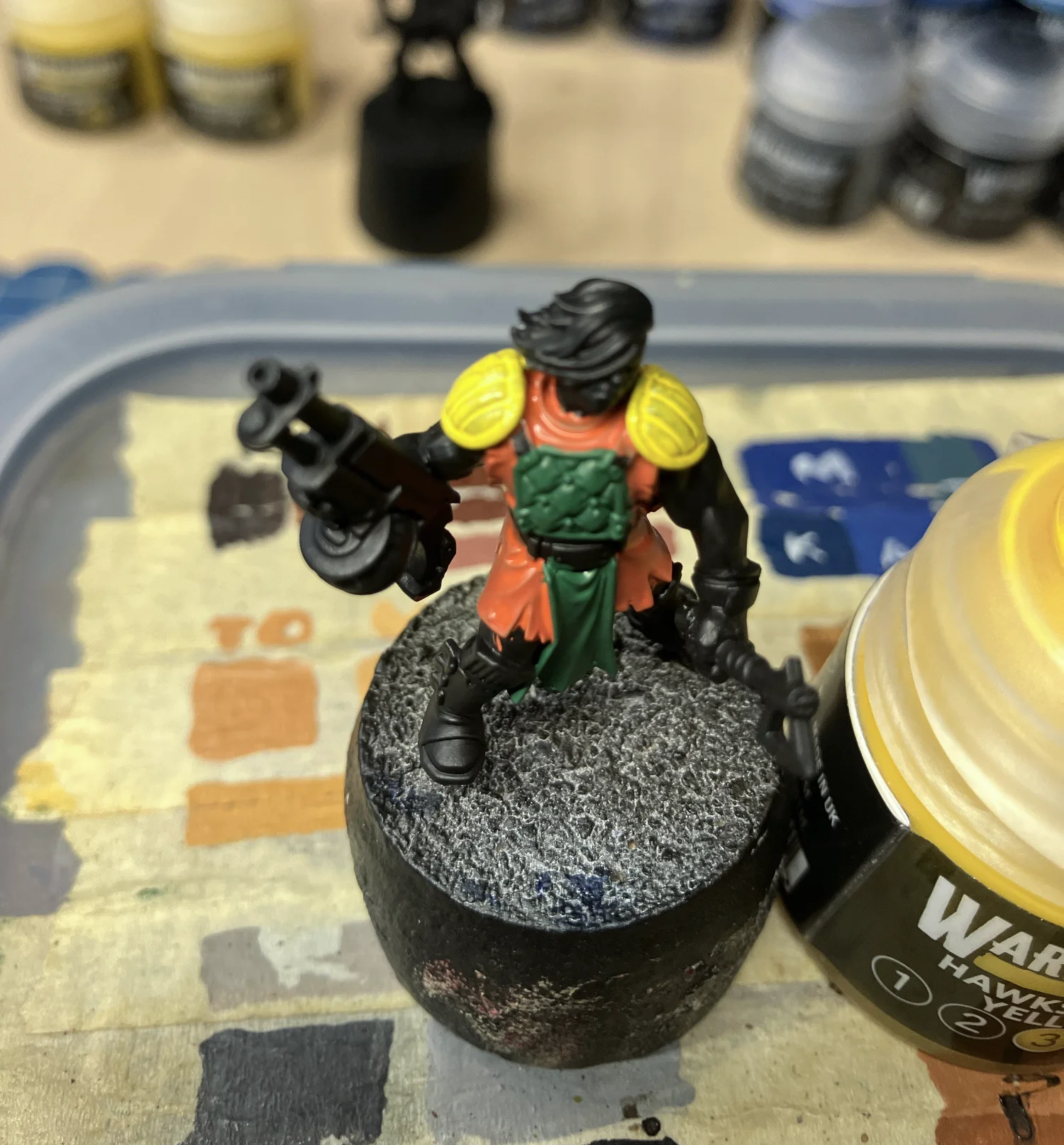
Matched Colors
I think Army Painter was the first paint company to release a series of related color bottles. For instance, you can buy an “olive-triad” and be relatively certain that if you base-coated with the mid-tone, you could pin wash with the darker tone and highlight with the lighter. Games Workshop has just taken that to the next level. And made it even more explicit.
is this like Apple where “Pro” just means you’re getting the kitchen sink for a few dollars more?
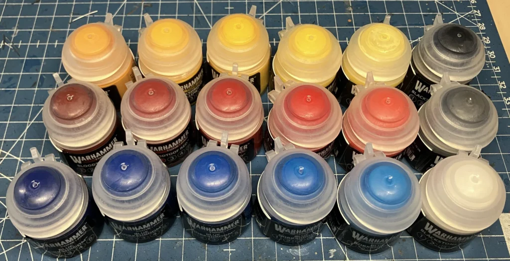
Instead of triads, Tone Pro paints operate in ranges of five related tones. There is absolutely nothing stopping anyone from base-coating with Tone 4 instead of Tone 3. But, if one wanted to put a second highlight on something that way, they’re either mixing their own highlight or choosing a paint from another line of tones. Which is what a lot of people will do. I’m sure there are color matches for a lot of older paints in the newer line but it kind of breaks the system in my mind.
Yes, yes, it says Tone “Pro”… but is it intended for more advanced painters? Or is this like Apple where “Pro” just means you’re getting the kitchen sink for a few dollars more? And pro-level painters don’t have any problems color matching tones for their paints. But you know who this does help out? The starting painter.
Which leads me to believe the intention of this paint line is to base with Tone 3, wash with Tone 1 or 2 and add one or two highlights with Tones 4 and 5. And, if that’s the case, it makes sense if the lower number tones have a higher pigment density than the higher number tones.
Shading Medium
One of the new things in this line is a pair of mediums to use with the paints. Citadel did this before with Lahmian Medium and Contrast Medium but both of those were essentially the same mediums as the paints were suspended in, just without the pigments. This allowed people to “thin” their pigment density without thinning the paint. Or, in the case of Contrast medium, to give a non-Contrast paint some Contrast-like properties.
Hot tip: do not use more than a pin-prick’s amount of pigment for about a brush-full or two of medium
The new Shading Medium is much like the Contrast Medium in that it brings new properties to the paint, in this case, acting more like a shade or a wash. It’s a tricky little beast, I’ll be honest. It doesn’t thin it in the way I would have expected from using Citadel shade paints for years. But if the mix is right, you can begin to tell so by running it up on the side of your palette. Hot tip, though, do not use more than a pin-prick’s amount of pigment for about a brush-full or two of medium or more medium will be required.
I used a fair amount of medium, just making up the three washes I did for this test. I admit, the last one required the least because I realized how little pigment was necessary to turn it into a wash, so this may just require a little experimentation to get right. But mixing paints and mediums just isn’t where my heart lives in this hobby. I like the ease of just dipping a brush into Nuln Oil and applying it directly.
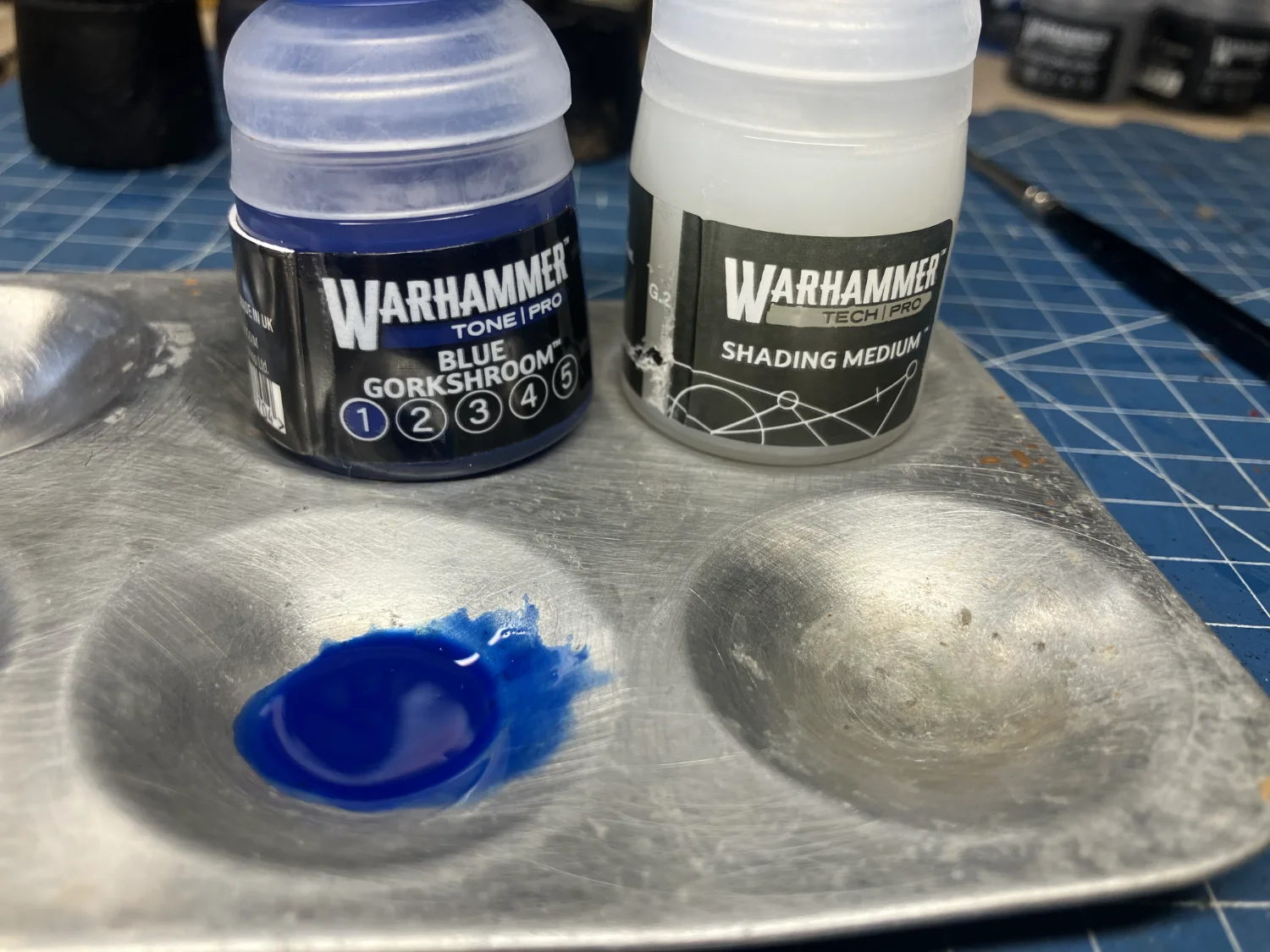
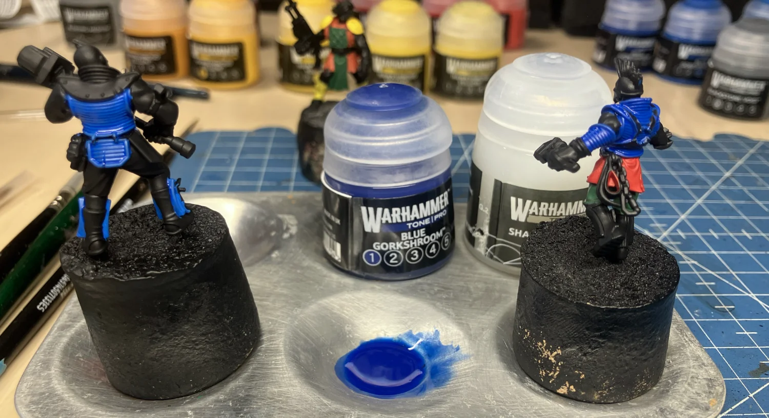
Highlighting
After one bases, washes, and possibly brings back the mid-tones, the last step is to highlight the color. And for this, I found the paints are pretty good. Certainly as good as any of the existing Citadel paint range. This might be the one area where the water absorption issues I described with the wet palette worked to the paint’s advantage in that it thinned down to just a little thicker than a glaze consistency and applied nicely over the previous layers.
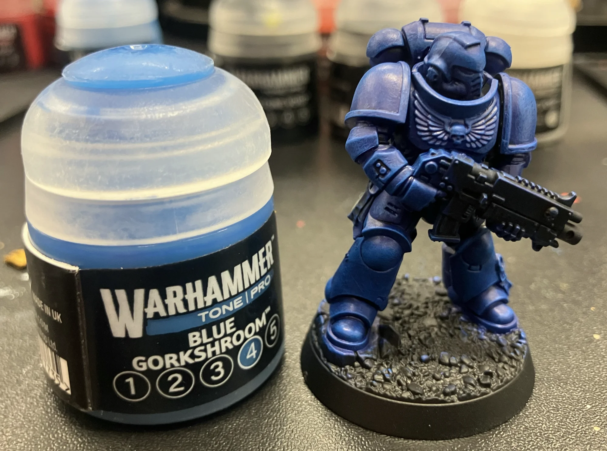
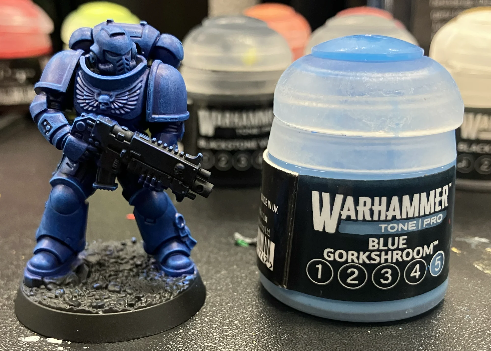
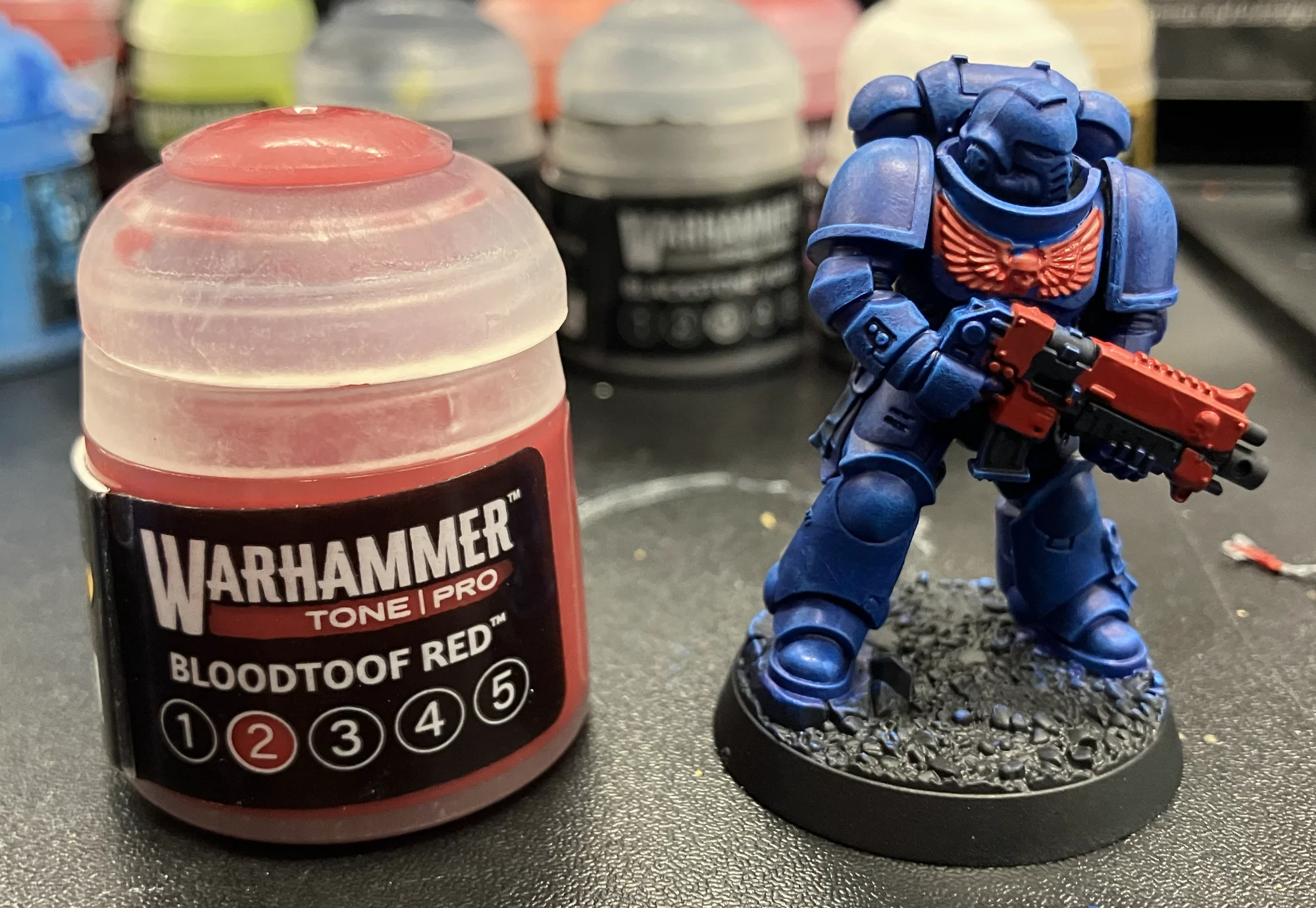
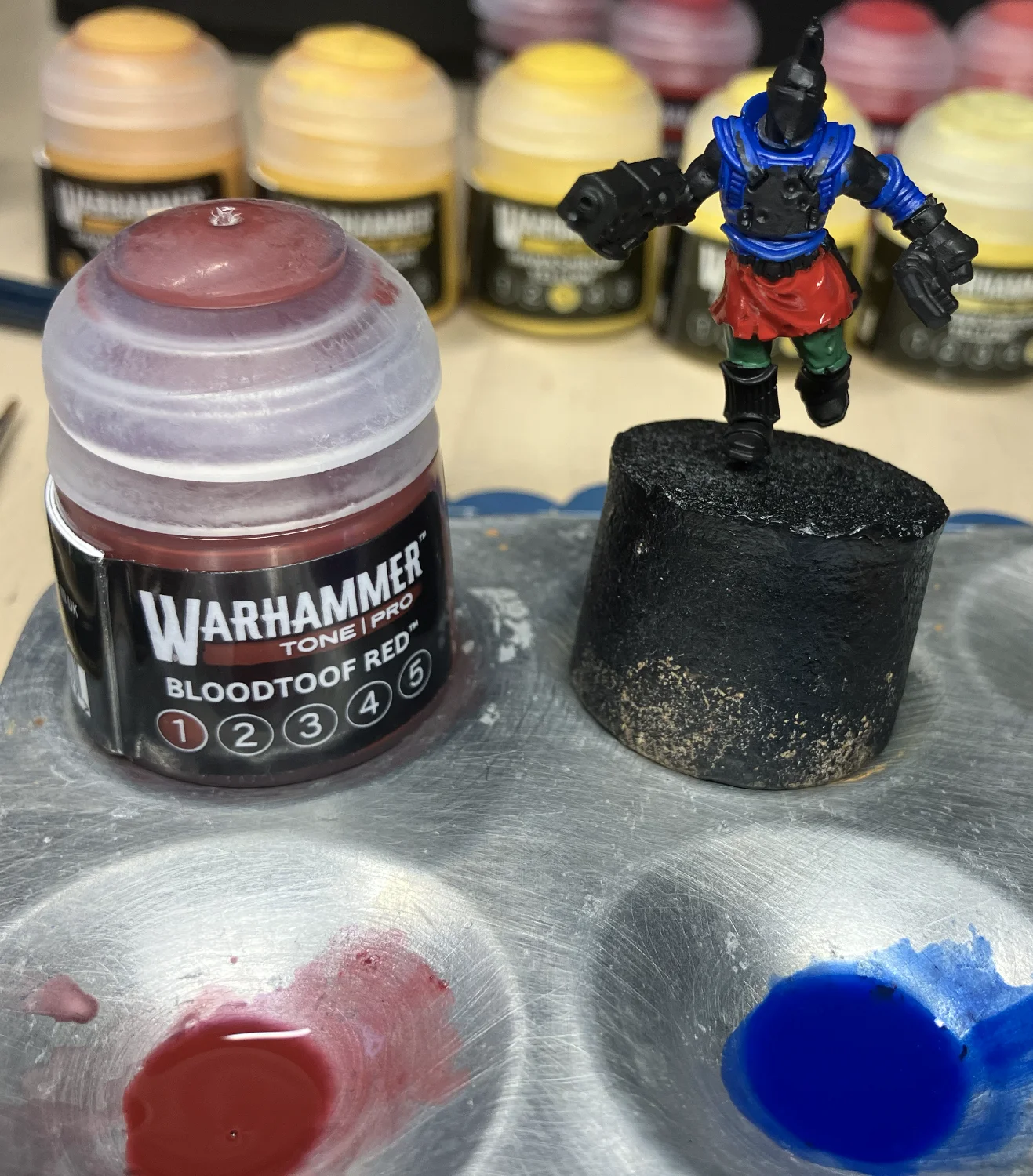
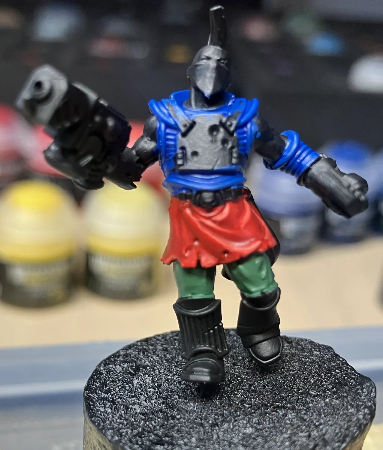
Since I mixed my own green and orange, I only tested the colors as they came out of the pots but the Blue Gorkshroom and the Bloodtoof Red both looked amazing. In fact, I like the Bloodtoof Red as much as my old red paint recipe. The Blue Gorkshroom was more electric toward the end than I expected but it’s a nice effect and definitely one I could see using in the future. But for more basic blues, I might look for something a little more toned down.
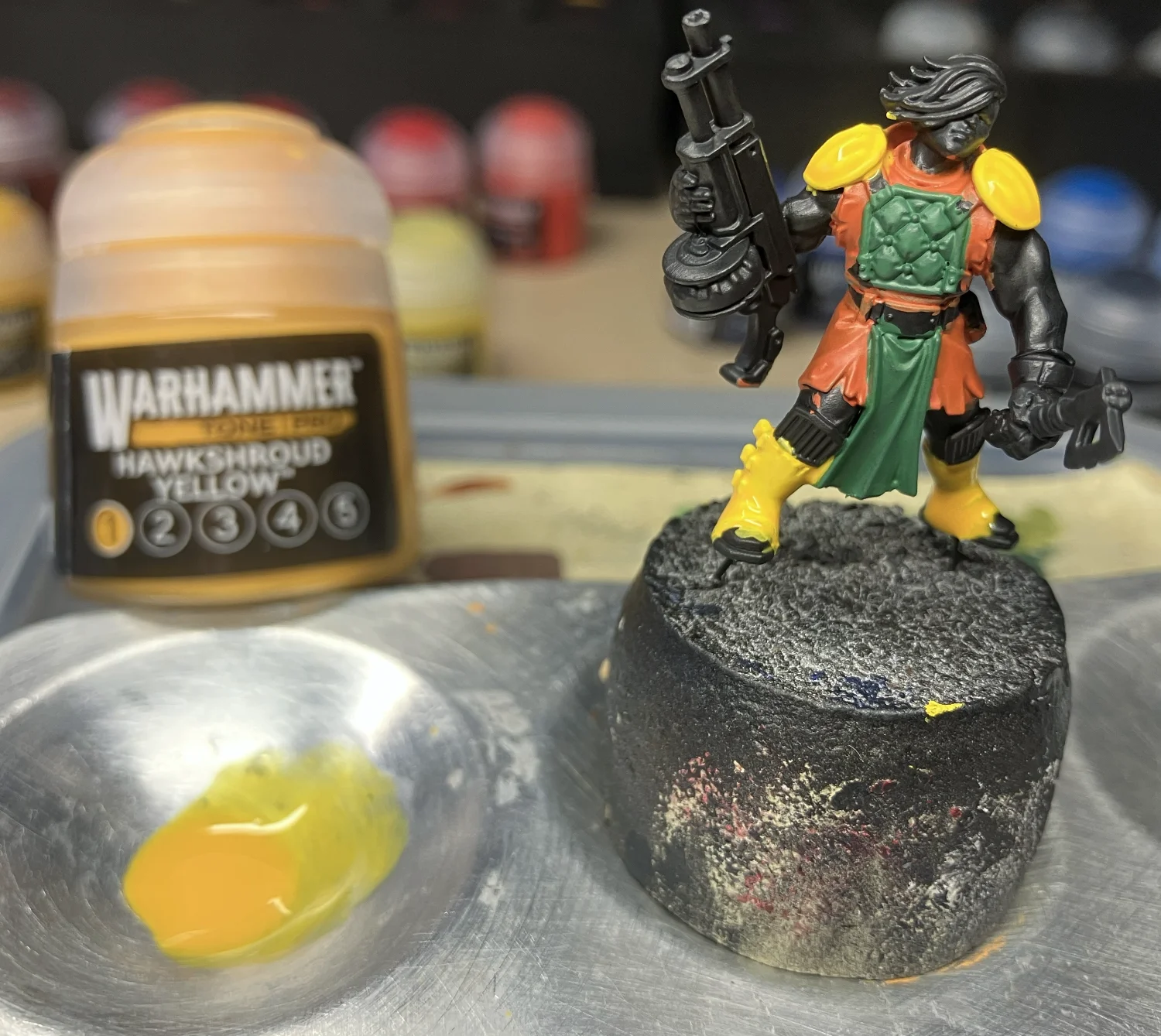
The Hawkshroud Yellow was one color that wasn’t great but wasn’t bad either. I found myself a little underwhelmed by the wash I made from Tone 1 and then equally so again by the highlight of Tone 5. As a color, I like Tone 1 a lot. But since the test was mid-tone, dark, and highlight, that unfortunately underperformed. Tone 5, as a highlight almost leaned too far towards white in luminosity. Knowing what I know now, if highlighting the same colors again, I might call it a day at Tone 4 being enough.
Verdict
So… where do the paints of the new Warhammer Tone Pro paint line stand?
Oooph… tough answer. There are things I liked very much about it. The pigment-rich application was amazing. Getting yellow on a miniature without having to paint white first or a million thin layers is the answer to a lot of prayers. The colors are super vibrant. The Blue Gorkshroom, especially, came out looking positively electric.
The thin, runny consistency keeps signaling to my brain […] that something is wrong
But, I also have to say, I’m just not used to the feeling of the paint out of the pot. The thin, runny consistency keeps signaling to my brain used to years of working with Citadel paints that something is wrong. And the thickness that it goes on with leaves me frightened every time that I’ve put too much paint on my model only to have it dry and reveal that, no, everything is actually fine.
I will say that in my limited experience thus far, the second tone in each series seems like the least necessary of them all. If the mini is based with Tone 3, then Tone 2 is too light to effectively work as a wash. And if Tone 2 is used as a base-coat, it’s too dark to tell the difference between it and Tone 1. It’s a reverse Goldilocks. It’s never “just right.” Tones 3, 4, and 5 all seem suitably differentiated. But, if I was building a new paint collection from scratch, I might just play the blues and get Tones 1, 3, and 5.
I also am not super keen on the Shading Medium. While it’s interesting to be able to make a wash out of any color, the amount of medium required to achieve the consistency that feels right strikes me as almost designed to churn through bottles of medium. My old Citadel washes could last me for years. Which is not a great thing for paint sales. But this pot of medium might need to be replaced far more often. Though, as I note above, practice may make perfect in this regard.
Lastly, I didn’t love how the paint reacted on my wet palette. It’s a key tool when painting for hours to ensure paint doesn’t get wasted by drying out. But in my tests, it just soaked up the water and became runny extremely quickly. And I didn’t find a dry palette entirely satisfactory either. I don’t know what the resolution is to this but it’s probably the biggest factor that might keep me away from expanding my little collection.
If someone were starting out in painting and had no experience with previous formulations or applications, I think Warhammer Tone Pro would be an easy recommend. They really do remove a lot of the frustration with base-coats and multiple layers without having to learn any tips or tricks. But as someone who has a collection and has been painting for a while, I’m a little more reserved in my praise. This obviously won’t be the last time I use them but, if I continue to feel weird about them, I may look at alternative brands when I need to replace colors, convenient or otherwise.