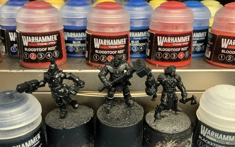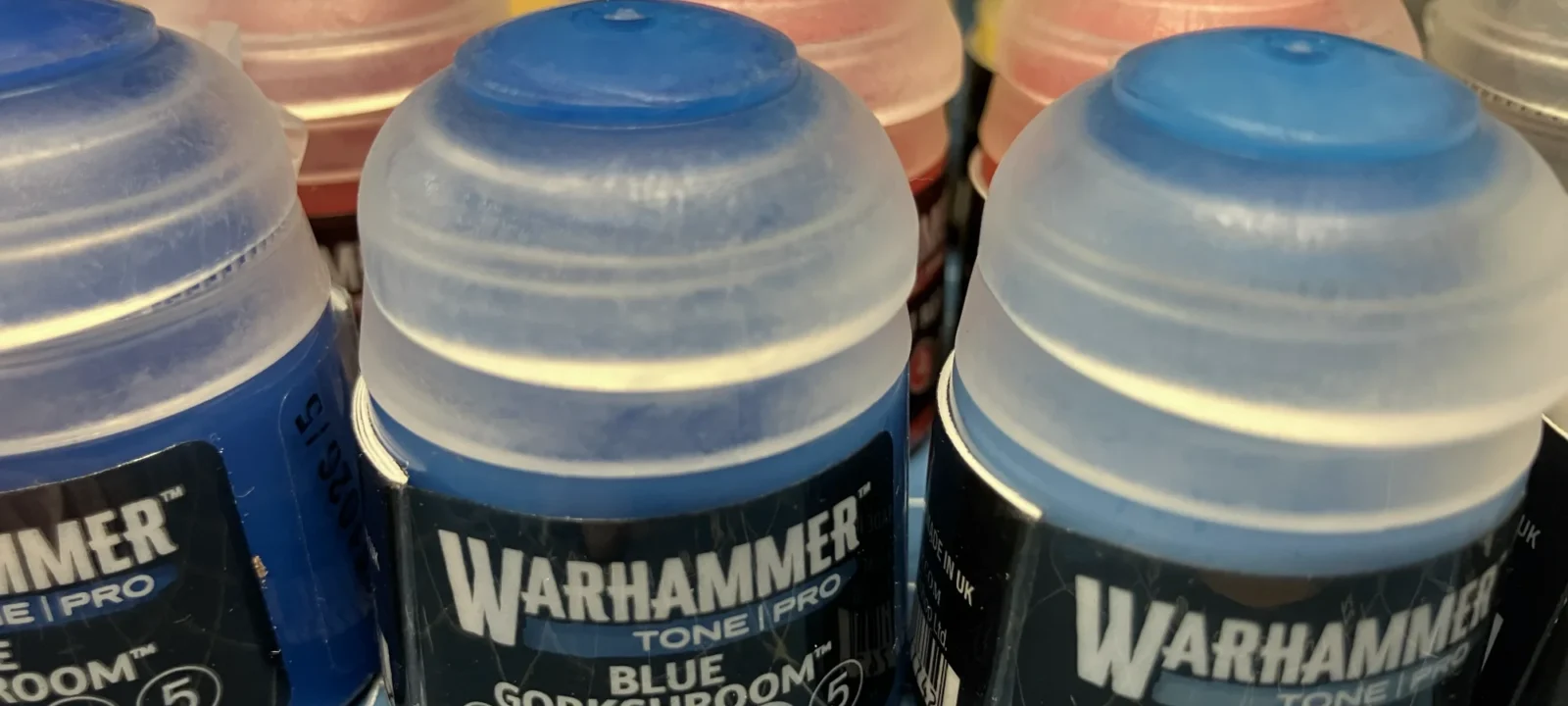
For the paint testing article, I bought three ranges of Warhammer Tone Pro, Bloodtoof Red, Hawkshroud Yellow, and Blue Gorkshroom. These seemed like the most “down the middle” colors one could want, with the widest number of application possibilities and ability to create mixed colors. But are they all new?
Spoiler alert, yes. The colors all seem to be brand new. I couldn’t find any that were spot-on color matches for the old Citadel paint line. And, even if they were, it wouldn’t matter a whole lot because they would have to have been reformulated into whatever medium makes Warhammer Tone Pro what it is. As the testing article describes, application of these paints is very different.
But, all that said, how does the new line compare to the old one? If you had a color you really loved, is it within the Tone Pro collection?
Well… there are some places where things get pretty close.
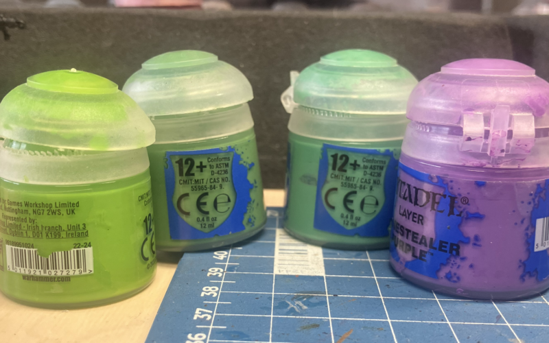
One thing to note before I run through these is that I do not have the complete paint range. As I said above, I picked three to test with. So if I don’t find an exact match, that doesn’t mean there might be not one that’s even closer. But I thought it still might be interesting to take a few of the paints I already owned and see how close the Tone Pro paints came. This is a case where visiting a store and doing your own side-by-side comparison can be worth the effort.
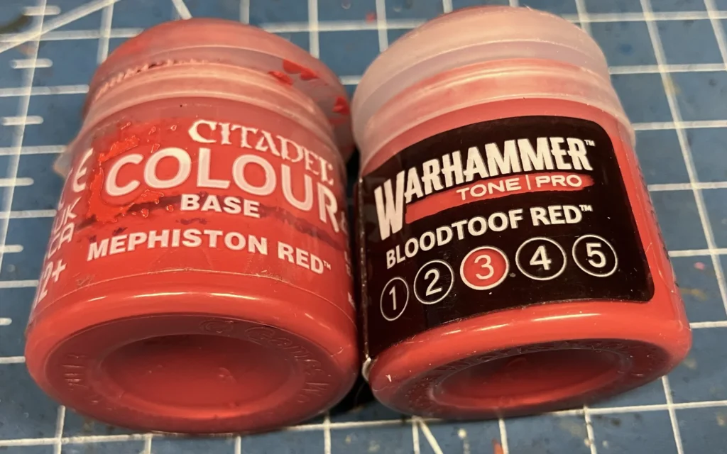
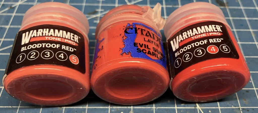
Mephiston Red is pretty close to Bloodtoof Number 3. It’s not a perfect match and, as with all the Tone Pro paints, the finish is different. I also thought Evil Sunz Scarlet sat right in between Number 4 and 5. And it was close enough that a 50/50 mix of 4 and 5 was, to my eye, essentially the same color. Which is great because Mephiston Red, a Nuln Oil wash, another layer of Mephiston Red, and then highlights of Evil Sunz Scarlet is my go-to red recipe.
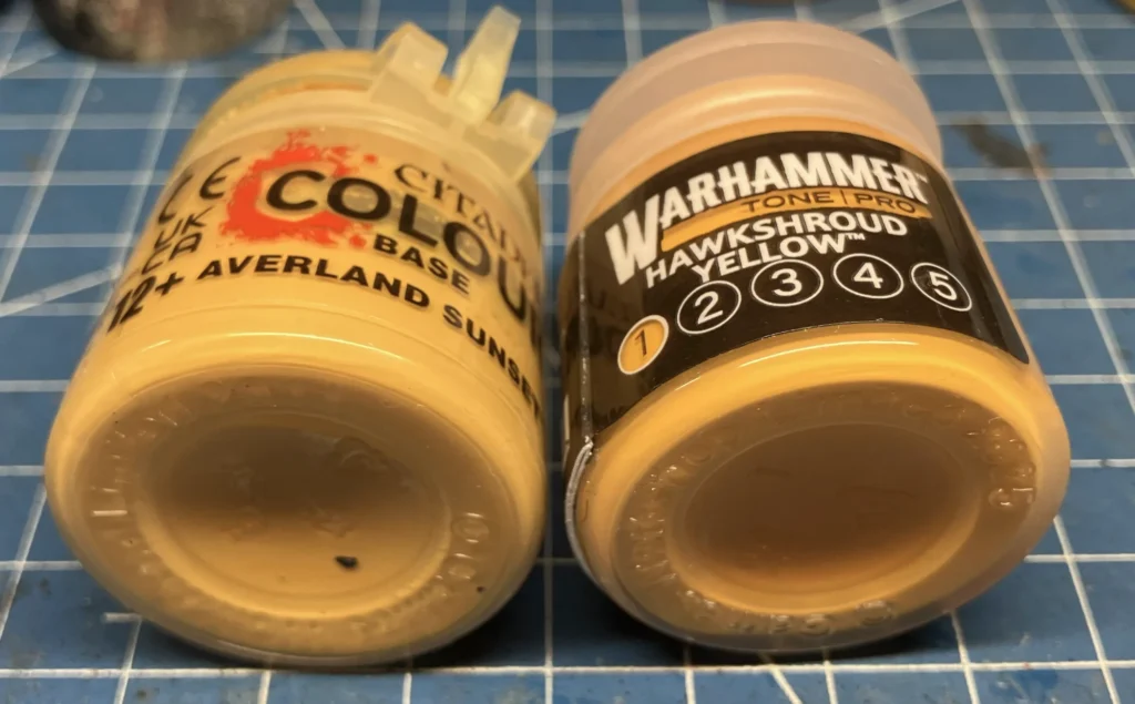
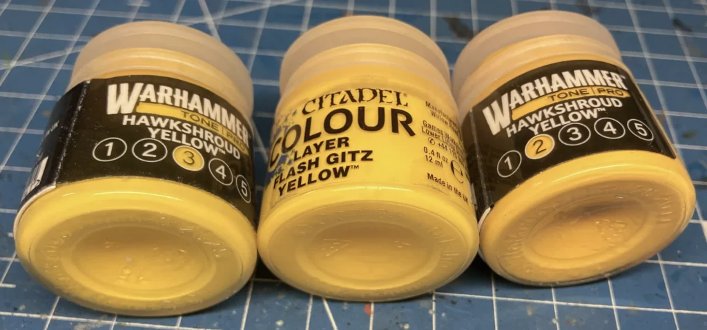
One of the reasons I selected Hawkshroud Yellow over Megaboss Yellow was that, at least online, Hawkshroud seemed to have a little more orange in it than what looked to be the more lemony Megaboss. I was hoping Number 1 would essentially be Averland Sunset as that’s one of my favorite yellows and it makes for some fantastic hazard stripes.
Unfortunately, at least within the Hawkshroud range, I couldn’t really find what I’d call a close enough match. When in the bottle Hawkshroud 1 and Averland Sunset looked very similar but when they went on a test model, they were very, very different.
Likewise, Flash Gitz Yellow looks like it sits between Hawkshroud Yellow Numbers 2 and 3 but, unlike Evil Sunz Scarlet, this isn’t really the case. I tried mixing the two and the color was nothing like Flash Gitz.
For yellows, I may just have to explore the Megaboss Yellow line and see how those shake out. But, then, I will probably be looking to buy specific colors and not whole tonal ranges.
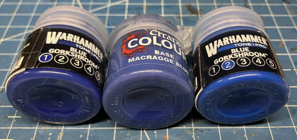
Of all the blues in my collection, the only one that came anywhere near the Blue Gorkshroom range was Macragge Blue and even that wasn’t really perfect. But, then, I didn’t really expect it to be. The Tone Pro line has four different blue tone ranges (and a fifth violet-toned range that has some blues) and one is actually called Ultramar Blue. I would hope that one of those would be an almost exact match to Macragge. I just found it interesting that, of the six or seven blues I own, Macragge was the only one to even get close to the Gorkshroom range.
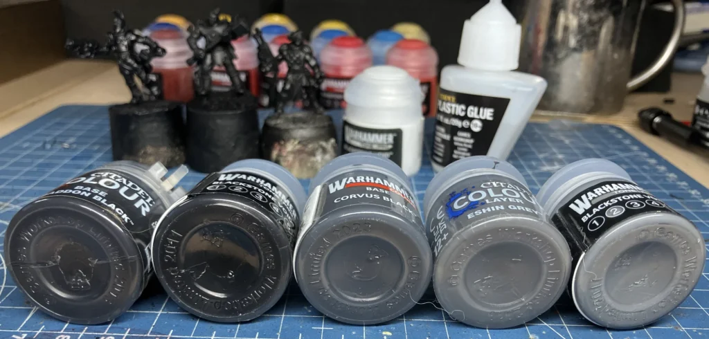
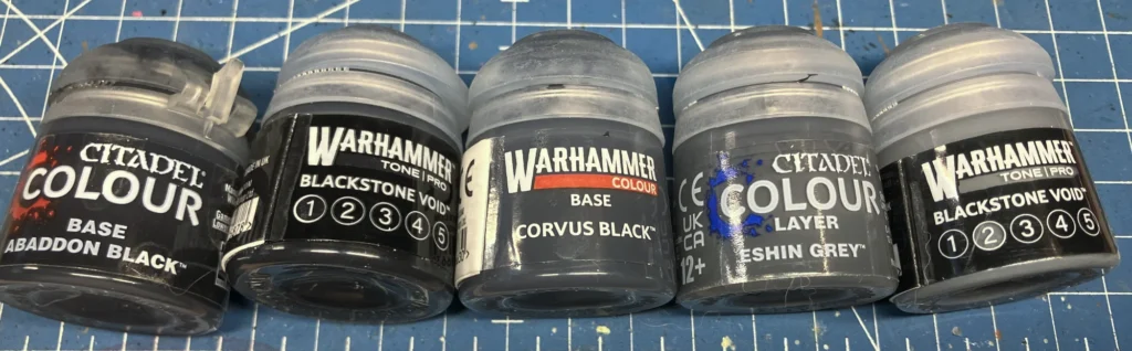
Last up was comparing some blacks and grays. I do think it’s hilarious that blacks, whites, and grays are all now lumped into Blackstone Void. I mean, I guess I see it, white being the opposite of black on the tonal scale, but it’s still odd to me. Abaddon Black is a very black paint, so it’s hard to imagine getting darker than that but Blackstone Void Number 1 does, though probably solely because of the finish and the way it reacts with the light.
When it came to gray, it looks like Corvus Black (or its equal) might have been moved into the Dataslate Gray range while the Blackstone Void Number 2 seems closest to Eshin Grey. Though, as with them all, it’s not an exact match and I’d say that 2 actually seems a hint lighter than Eshin Grey, which makes the jump from 1 to 2 wider, tonally, than from Abaddon Black to Eshin Grey.
It’s a pretty bold move of Games Workshop to introduce a whole new paint line like this, possibly to replace the existing range entirely, as a lot of people have developed a lot of painting recipes over the years. If there really are one-to-one matches for every color then people will adjust to learning the new names. But, if there’s no equivalent to a person’s favorite color, this could be an interesting hinge point for people and their brand loyalty.
Often people stay with a product out of inertia. They already have a collection of something, they go into the store twice a month anyway… replacing a color here or there isn’t that much of a lift versus investing in a whole new paint range. But if the paint range is changing anyway, and changing substantially, then it might make people start to look around at other options.
I am not saying that this will necessarily be the case. But I was curious enough about it to go through my paints to see if I could find matches.